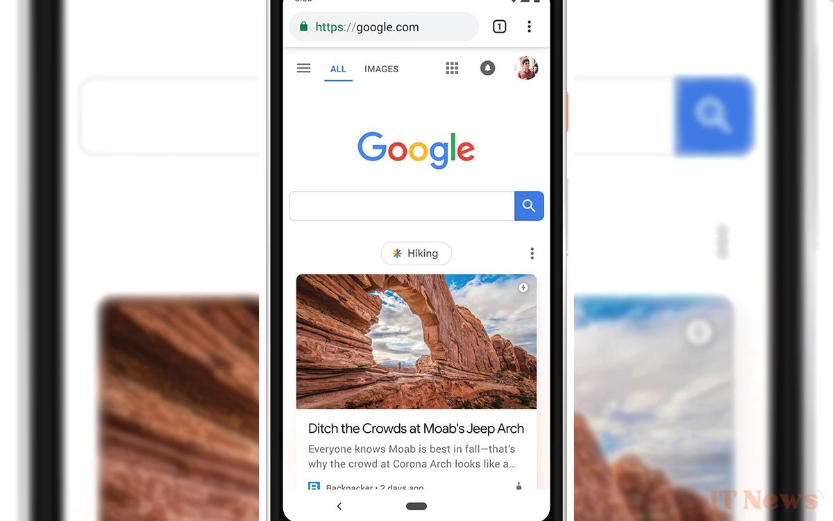
Google is rolling out a new design for the Discover page, which lists the latest news. A design that seems to be a step backward, with the disappearance of rounded-edge cards in favor of a more classic design, with rectangular images that now span the entire width.
Google Discover is getting a new design on many Android smartphones. The Discover service refers to the news that appears on Android smartphones and tablets, and also in the Google app on iPhone. A news feed compiled automatically based on user preferences. Data includes things like Google search history, YouTube, other app activity – and pretty much anything else you agree to in your account preferences.
A daily staple for many people around the world, this news feed used to appear as elegant cards with rounded edges. These included, from top to bottom, a large image, a catchy headline, and a bit of text (since removed for legal reasons), all separated edges of the screen and other cards with rather elegant margins. The color of the cards contrasts with a darker background, allowing them to stand out more visually.
The new design of the news feed on Android may not please everyone
A design that is the result of an iterative evolution that follows the latest design codes developed by Google. In contrast, what appears to be the new look of the news feed completely throws these codes in the trash. As you can see in the screenshot we've embedded in this article, the new layout feels a bit like a throwback. We have a more classic design without cards, with a full-width image.
While some of our colleagues initially thought it was a bug or a limited test, it turns out that the change is indeed intentional. 9to5Google explains that the new design is currently being rolled out to "a large number of Android devices." So, it's going to take some getting used to, whether you like it or not. For now, the change isn't visible on all devices. The rollout is happening gradually, and seems to be mostly being done from Google's servers.


0 Comments